Data visualization I
Data visualization is one of the most important and difficult skills to master for scientific communication. Each graphic has to tell a story.
Philosophy
"Above all else show the data"

"A large share of ink on a graphic should present
 data-information, the ink changing as the data change.
  Data-ink is the non-erasable core of a graphic, the
   non-redundant ink arranged in response to variation
    in the numbers represented"

Tufte, 1983, The Visual Display of Quantitative Information
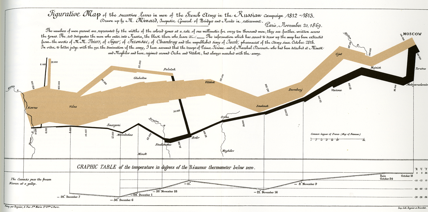
A good plot should tell a complete story. For instance, this one tells the story of Napoleon's Grande Armée:

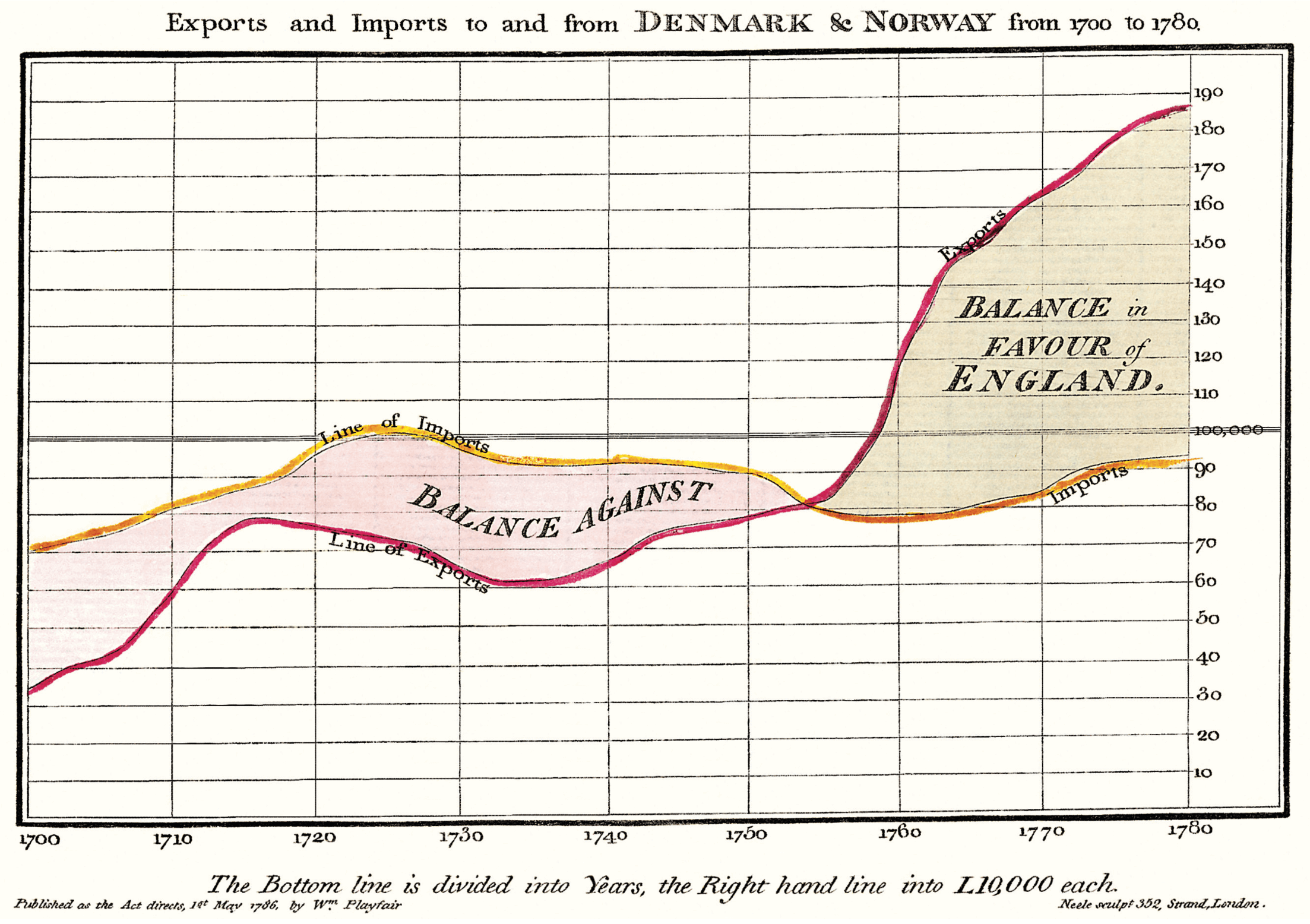
Even something boring can be made to look interesting:

Intro to ggplot2
Notebook here.
Links
- R Cookbook Indespensible reference for how to do things with ggplot2
- ggplot2 cheatsheet Good concise reference
- Intro to ggplot2 Well done lecture using
In-class exercise
- Using the Iris data set, make a plot that clearly separates the three species along two morphological axes.
Homework
- Using any appropriate data set, create the following types of plots
- a violin plot
- a rug plot
- a scatterplot with groups of points, but without a legend
- A scatterplot without x-axis ticks
- annotate a plot with text
- Take two separate plots in made usig ggplot and arrange them in in columns (not using facet_grid). Hint: you will need to use another library.
- Draw a histogram of points with a fitted normal distribution (this looks better if your data are roughly normally distributed). E.g., here
- Implement some plots using the ggplot libary in Python
- Using Titanic survivor data, make a plot to show whether "women and children first" changed the odds of survival. Was economic class a factor?
- Make a chord diagram in R, using any library and data set