6. Human population growth
There is a challenge for this chapter. Coming this far in the book you have learned a little about population growth, and you have access to computer coding, so you are ready for something big.
Imagine for fun that you have accepted a new job in Washington as a policy fellow with the United States Geological Survey, or USGS - one of the major research branches of the US federal government. This is not farfetched; many recent doctoral graduates land such jobs at reasonably high levels. But suppose that your boss says she wants you to calculate what the world’s population will be in 2100. Other agencies have done this, but she wants a separate USGS estimate, presented in an understandable way. She can give you data from the 18th through the 21st centuries. She discloses that she is meeting with the Secretary General of the United Nations tomorrow and hopes you can figure it out today. You tell her “Sure, no problem.”
Are you crazy? No! The rest of this chapter will walk you through how to it. We’ll start by piecing together the parts, as in Figure 4.4 - the orthologistic part, if there is one, and any exponential and logistic parts as well.
6.1. Phenomological graph
The excerpt of data you have been given includes the world’s population in billions, by year. That is all. Figure 6.1 shows the data plotted in a phenomenological way - population size versus year, supplemented with a curve going back 2000 years to provide perspective. The blue dots show the range of data you will be using to project the future population, and the black ‘X’ marks a great demographic transition that is not obvious in this graph, but that will become glaringly so in Figure 6.3.
suppressPackageStartupMessages({
  library(tidyverse)
}) # hide annoying messages
# data from https://ourworldindata.org/world-population-growth
worldPopulation <- read_csv("../data/WorldPopulationAnnual12000years_interpolated_HYDEandUNto2015.csv", skip = 1, col_names = c("year", "population"), col_types = "nn")
filter(worldPopulation, year > 0) %>% ggplot(aes(year, population/10^9)) +
  geom_point() +
  geom_line() +
  annotate(geom = "text", label = "X", y = 3.350, x = 1965, size = 9, color = "blue") +
  annotate("segment", x = 476, y = 2, xend = 476, yend = .5, colour = "blue", arrow = arrow(type = "closed", length = unit(0.02, "npc"))) +
  annotate("text", x = 476, y = 2, label = "Fall of Rome", color = "blue", angle = 90, hjust = - .1, fontface = "bold") +
  annotate("segment", x = 476, y = 2, xend = 476, yend = .5, color = "blue", arrow = arrow(type = "closed", length = unit(0.02, "npc"))) +
  annotate("rect", xmin = c(500,500), xmax = c(1500,1500), ymin = c(.1, .1), ymax = c(0.9, 0.9), alpha=0.1, color=NA, fill="blue") +
  annotate("text", x = 1000, y = .6, label = "Middle Ages", color = "blue", fontface = "bold") +
  annotate("segment", x = 1666, y = 2, xend = 1666, yend = .6, colour = "blue", arrow = arrow(type = "closed", length = unit(0.02, "npc"))) +
  annotate("text", x = 1666, y = 2, label = "Great Plague of London", color = "blue", angle = 90, hjust = - .1, fontface = "bold") +
  annotate("segment", x = 1346, y = 2, xend = 1346, yend = .6, colour = "blue", arrow = arrow(type = "closed", length = unit(0.02, "npc"))) +
  annotate("text", x = 1346, y = 2, label = "Black Death", color = "blue", angle = 90, hjust = - .1, fontface = "bold") +
  theme_bw() + xlab(expression(paste(italic(t), ", Year"))) + ylab(expression(paste(italic(N), ", World Population (billions)"))) +
  # labs(caption = "Figure 6.1 Global human population over the past 2000 years") +
  theme(plot.caption = element_text(hjust = 0.5))
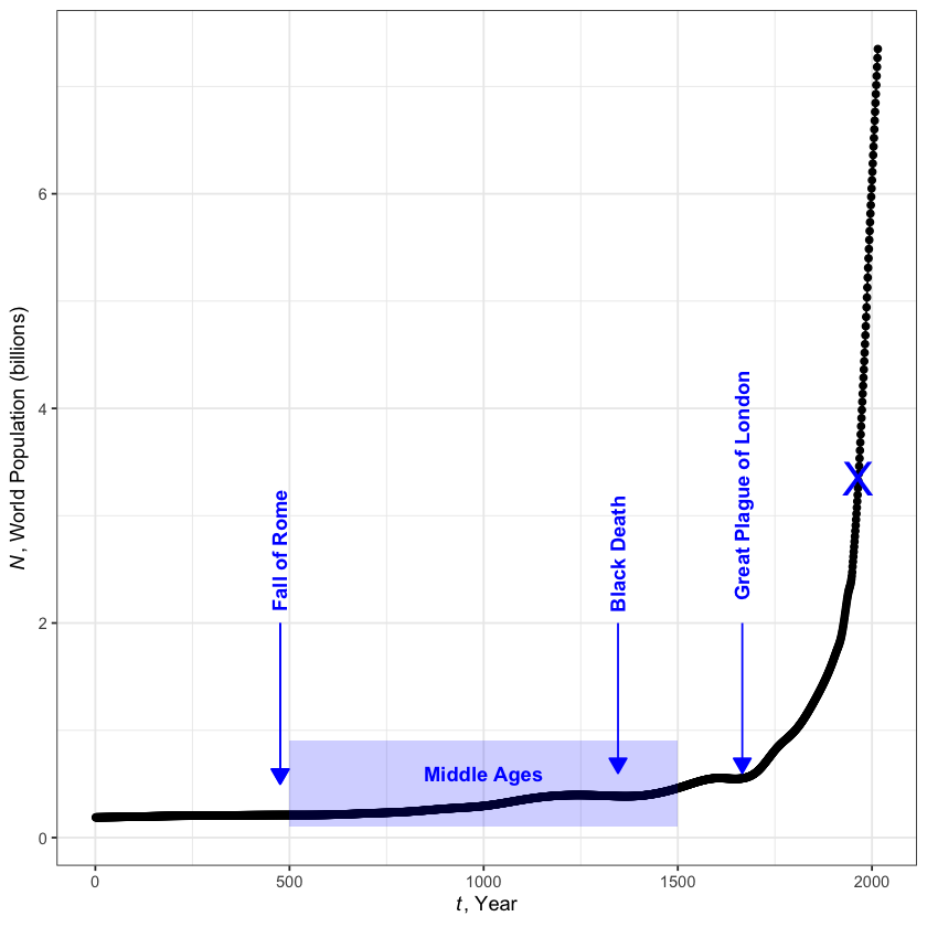
World population over the past 2000 years
Can you project global population by simply extending that curve? The population is clearly rising at an enormous rate, expanding most recently from 3 billion to 7 billion in less than half a century. Simply projecting the curve would lead to a prediction of more than 11 billion people by the middle of the 21th century, and more than 15 billion by the century’s end.
But such an approach is too simplistic. In one sense, the data are all contained in that curve, but are obscured by the phenomena themselves. We need to extract the biology inherent in the changing growth rate \(r\) as well as the ecology inherent in the changing density dependence \(s\). In other words, we want to look at data showing \(1/N\,\Delta N/\Delta t\) versus \(N\), as in Figure 4.4.
Table 6.1 shows a subset of the original data, \(t\) and \(N\), plus calculated values for \(\Delta N\), \(\Delta t\), and \(1/N\,\Delta N/\Delta t\). In row 1, for example, \(\Delta N\) shows the change in \(N\) between row 1 and row 2: \( 0.795 - 0.606 = 0.189 \) billion. Likewise, \(\Delta t\) in row 1 shows how many years elapse before the time of row 2: \( 1750 - 1687 = 63 \) years. The final column in row 1 shows the value of \(1/N\,\Delta N /\Delta t\): \( 1 / 0.606 \times 0.189 / 63 = 0.004950495 \dots,\) which rounds to \(0.0050\). Row 21 has no deltas because it is the last row in the table.
Table 6.1 Human population numbers for analysis.
suppressPackageStartupMessages({
  library(kableExtra)
  library(IRdisplay)
}) # hide annoying messages
options(knitr.kable.NA = '') # don't plot missing values
humanPopulation <- read_tsv("../data/humans.tsv", col_types = "nn") # read in data

# assign values from the table to humanPopulation_df (human population dataframe)
humanPopulation_df <- humanPopulation %>%
  mutate(dN = c(diff(population), NA), dT = c(diff(year), NA), rate = 1 / population * dN / dT)

# Render as html table
humanPopulation_df %>%
  kbl(col.names = c("t (years)", "N (billions)", "$\\Delta N$", "$\\Delta t$", "$\\frac{1}{N} \\frac{\\Delta N}{\\Delta t}$"),
    digits = c(0, 3, 3, 0, 4)) %>%
  as.character() %>%
  display_html()
| t (years) | N (billions) | $\Delta N$ | $\Delta t$ | $\frac{1}{N} \frac{\Delta N}{\Delta t}$ |
|---|---|---|---|---|
| 1687 | 0.606 | 0.189 | 63 | 0.0050 |
| 1750 | 0.795 | 0.174 | 50 | 0.0044 |
| 1800 | 0.969 | 0.296 | 50 | 0.0061 |
| 1850 | 1.265 | 0.391 | 50 | 0.0062 |
| 1900 | 1.656 | 0.204 | 20 | 0.0062 |
| 1920 | 1.860 | 0.210 | 10 | 0.0113 |
| 1930 | 2.070 | 0.230 | 10 | 0.0111 |
| 1940 | 2.300 | 0.258 | 10 | 0.0112 |
| 1950 | 2.558 | 0.224 | 5 | 0.0175 |
| 1955 | 2.782 | 0.261 | 5 | 0.0188 |
| 1960 | 3.043 | 0.307 | 5 | 0.0202 |
| 1965 | 3.350 | 0.362 | 5 | 0.0216 |
| 1970 | 3.712 | 0.377 | 5 | 0.0203 |
| 1975 | 4.089 | 0.362 | 5 | 0.0177 |
| 1980 | 4.451 | 0.405 | 5 | 0.0182 |
| 1985 | 4.856 | 0.432 | 5 | 0.0178 |
| 1990 | 5.288 | 0.412 | 5 | 0.0156 |
| 1995 | 5.700 | 0.390 | 5 | 0.0137 |
| 2000 | 6.090 | 0.384 | 5 | 0.0126 |
| 2005 | 6.474 | 0.392 | 5 | 0.0121 |
| 2010 | 6.866 |
6.2. Biological-ecological graph
suppressWarnings(suppressMessages(library(ggplot2))) # hide annoying messages

ggplot(data = humanPopulation_df[0:13,],
                  aes(x = population,
                      y = rate)) +
  geom_point(color='blue') +
  theme_bw() +
  theme(axis.title.y = element_text(angle = 0, vjust = 0.5, hjust=1)) +
  scale_x_continuous(name = expression(paste(italic("N,"), " population in billions")),
                     breaks = seq(0, 12),
                     limits = c(0, 12)) +
  scale_y_continuous(name = expression(paste(frac(1, italic("N")), " ", frac(italic("dN"), italic("dt")))),
                     breaks = seq(0, .03, by = 0.01),
                     limits = c(0, 0.03)) +
  geom_abline(slope = 0.00648, intercept = -0.001185, colour = "darkgreen") +
  annotate("text", x = 1, y = 0.028, label = expression(italic("r") == -0.001185)) +
  annotate("text", x = 0.9, y = 0.026, label = expression(italic("s") == 0.00648)) +
  # Arrow pointing at 1962
  annotate("text", x = 0.5, y = 0.0216, label = "1962", color = "grey", hjust = - .1, fontface = "bold") +
  annotate("segment", x = 2.1, y = 0.0216, xend = 3.12, yend = 0.0216, color = "grey",
           arrow = arrow(type = "closed", length = unit(0.02, "npc"))) +
  # Arror pointing at 1687
  annotate("text", x = 0.606, y = 0.002, label = "1687", color = "grey", hjust = - .1, fontface = "bold") +
  annotate("segment", x = 0.606, y = 0.002, xend = 0.606, yend = 0.0042, color = "grey",
           arrow = arrow(type = "closed", length = unit(0.02, "npc")))
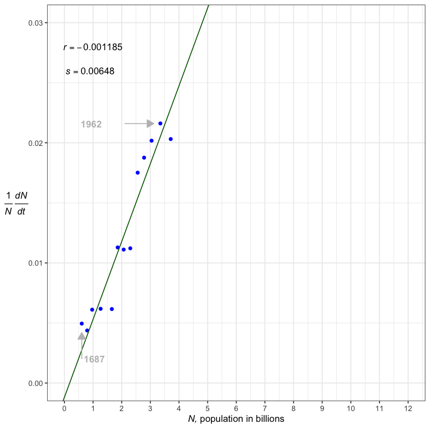
Figure 6.2 plots the two green columns of Table 6.1 through line 12—the mid-1960s—in blue dots, with a green line representing the average trend. A line like this can be drawn through the points in various ways—the simplest with a ruler and pen drawing what looks right. This one was done using a statistical “regression” program, with \(r\) the point at which the line intersects the vertical axis and \(s\) the line’s slope—its \(\Delta y/\Delta x\). The intrinsic growth rate \(r\) for modern, global human population is apparently negative and the slope \(s\) is unmistakably positive.
From the late 1600s to the mid 1960s, then, it’s clear that the birth rate per family was increasing as the population increased. Greater population was enhancing the population’s growth. Such growth is orthologistic, meaning that the human population has been heading for a singularity for many centuries. The singularity is not a modern phenomenon, and could conceivably have been known before the 20th century.
The negative value of \(r\), if it is real, means there is a human Allee point. If the population were to drop below the level of the intersection with the horizontal axis—in this projection, around two hundred million people—the human growth rate would be negative and human populations would decline. The Allee point demonstrates our reliance on a modern society; it suggests that we couldn’t survive with our modern systems at low population levels—although perhaps if we went back to hunter–gatherer lifestyles, this would change the growth curve. The Allee point thus indicates that there is a minimum human population we must sustain to avoid extinction. We depend on each other.
6.3. 6.3 A global transition
In Figure 6.3 we add data from the mid-1960s to the present day. People living in the 1960s were completely unaware of the great demographic transition that was developing. For hundreds of years prior to this time, human populations were stuck on an orthologistic path, with a singularity ever looming and guaranteed by the positive slope. In most of the world, however, the slope abruptly turned about and negative. Not all countries of the world turned about, but on average the world did. Humanity started down a logistic-like path.
6.3.1. Code to generate figure 6.3
Figure 6.3 includes the full data frame and additional best fit line. We can modify the code for figure 2 as follow.
worldPopulation <- read_csv("../data/WorldPopulationAnnual12000years_interpolated_HYDEandUNto2015.csv", skip = 1,
                            col_names = c("year", "population"), col_types = "nn") %>%
  filter(year > 0)

fig_6_3_df <- worldPopulation %>%
  filter(year %in% c(humanPopulation_df$year, 1915, 1940, 1960:2000)) %>%
  mutate(population = population/1000000000) %>%
    mutate(dN = c(diff(population), NA), dT = c(diff(year), NA), rate = 1 / population * dN / dT)

fig_6_3 <- ggplot(data = fig_6_3_df,
       aes(x = population,
           y = rate)) +
  geom_point(color='blue') +
  geom_line() +
  theme_classic() +
  scale_x_continuous(name = expression(paste(italic("N,"), " population in billions")),
                     breaks = seq(0, 12),
                     limits = c(0, 12)) +
  scale_y_continuous(name = expression(paste(frac(1, italic("N")), " ", frac(italic("dN"), italic("dt")))),
                     breaks = seq(0, .03, by = 0.01),
                     limits = c(0, 0.03)) +
  geom_abline(slope = 0.00648, intercept = -0.001185, colour = "darkgreen") +
  annotate("text", x = 6, y = 0.01, label = expression(italic("r") == 0.03077)) +
  annotate("text", x = 6, y = 0.007, label = expression(italic("s") == -0.00289)) +
  annotate("text", x = 1, y = 0.028, label = expression(italic("r") == -0.001185)) +
  annotate("text", x = 0.9, y = 0.026, label = expression(italic("s") == 0.00648)) +
  # Arrow pointing at 1962
  annotate("text", x = 1.5, y = 0.0216, label = "1962", color = "grey", hjust = - .1, fontface = "bold") +
  annotate("segment", x = 2.1, y = 0.0216, xend = 3.12, yend = 0.0216, color = "grey",
           arrow = arrow(type = "closed", length = unit(0.02, "npc"))) +
  # Arror pointing at 1687
  annotate("text", x = 0.606, y = 0.002, label = "1687", color = "grey", hjust = - .1, fontface = "bold") +
  annotate("segment", x = 0.606, y = 0.002, xend = 0.606, yend = 0.0042, color = "grey",
           arrow = arrow(type = "closed", length = unit(0.02, "npc"))) +
  # arrows at different year
  annotate("text", x = 1.8, y = 0.005, label = "1915", color = "grey", hjust = - .1, fontface = "bold") +
  annotate("segment", x = 1.8, y = 0.005, xend = 1.8, yend = 0.0065, color = "grey",
           arrow = arrow(type = "closed", length = unit(0.02, "npc"))) +
  annotate("text", x = 2.3, y = 0.0095, label = "1940", color = "grey", hjust = - .1, fontface = "bold") +
  annotate("text", x = 3.02, y = 0.015, label = "1960", color = "grey", hjust = - .1, fontface = "bold") +
  annotate("segment", x = 3.02, y = 0.015, xend = 3.02, yend = 0.0188, color = "grey",
           arrow = arrow(type = "closed", length = unit(0.02, "npc"))) +
  # Arrow down
  geom_segment(aes(x = 3.350, y = 0.0216, xend = 8, yend = (0.03077 + 8 * -0.00289)), linetype=1, arrow=arrow(length=unit(0.4,"cm"))) +
  geom_segment(aes(x = 3.350, y = 0.0216, xend = 10.57, yend = 0),linetype=2)

fig_6_3
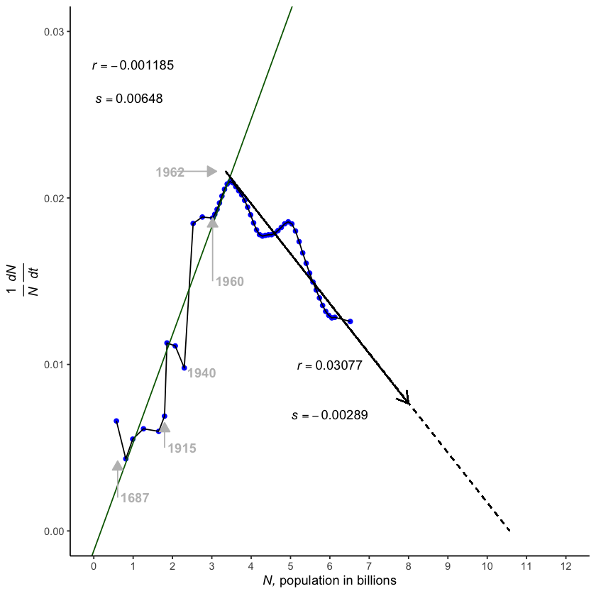
Where the downward-sloping line crosses the horizontal axis is where population growth would cease. From this simple \(r+sN\) model, it appears that world’s population will stabilize between 10 and 12 billion. That is in line with other recently published projections.
Prior to the 1960s there were dips in the increasing growth, with World Wars I and II levelling the rate of increase worldwide, though population continued to grow rapidly. The rate also fell in 1960, corresponding to extreme social disruptions in China.
What caused this great demographic transition, averaged over the globe? The “Four Horsemen” (conquest, war, famine, and plague) commonly expected to check human populations were not a primary cause. In many regions birth control, became more available. Education slowed reproduction because people got married later. Modern medicine raised survival rates, making large families unnecessary. The space program looked back at Earth and projected a fragile dot suspended in the black of space, viewed by billions. China’s one-child policy had a noticeable effect. However, so did HIV, one of the few Horsemen that has made a noticeable comeback.
# Data on fertility, income, population from World Bank, UN, Gapminder.org, and more
income_fertility_df <- read_csv("../data/ch6_income_fertility_worldbank_data.csv")

## A few countries to represent different continents
representative_countries <- c("United Kingdom","France", "Germany", "Russia",
                              "Australia", "New Zealand", "Papua New Guinea", "Tonga",
                              # "United States", "Mexico", "Canada", "Jamaica",
                              "China", "Vietnam", "India", "Thailand",
                              "South Africa", "Nigeria", "Cameroon", "Sudan")

# Filter data with just representative countries and from 1950 onwards
income_fer_df <- income_fertility_df %>%
  mutate(country = factor(country),
         year = as.numeric(year),
         adjusted_gdp = adjusted_gdp/1000) %>%
  filter(year %in% 1950:2010)

income_fer_df_rep <- income_fertility_df %>%
   filter(country %in% representative_countries)


representative_countries <- c("United Kingdom","France", "Germany", "Russia",
                              "Australia", "New Zealand", "Papua New Guinea", "Tonga",
                              # "United States", "Mexico", "Canada", "Jamaica",
                              "China", "Vietnam", "India", "Thailand",
                              "South Africa", "Nigeria", "Cameroon", "Sudan")

# Best fit line
fit_data <- read_csv("../data/ch6_fecundity_by_income.csv")

ggplot() +
  geom_point(data = income_fer_df, aes(x = adjusted_gdp, y = fertility, size = population, colour = Continent), alpha=0.7) +
  scale_size(range = c(1, 5), name = "Population (M)") +
  theme_bw() +
  scale_x_continuous(breaks = seq(0, 50, by = 5),
                     limits = c(0, 50)) +
  theme(legend.position="bottom") +
  ylab("Lifetime Births per Female") +
  xlab("Gross domestic product, thousands per capita") +
  geom_line(data = fit_data, aes(x = gni, y = life_births), colour = "red", size = 2)


# Representative countries
ggplot() +
  geom_point(data = income_fer_df_rep, aes(x = adjusted_gdp, y = fertility, size = population, colour = country), alpha=0.7) +
  scale_size(range = c(1, 10), name = "Population (M)") +
  theme_bw() +
  theme(legend.position="none") +
  ylab("Lifetime Births per Female") +
  xlab("Gross domestic product, thousands per capita") +
  facet_wrap(~ Continent + country)
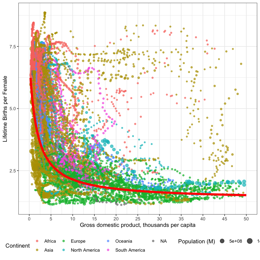
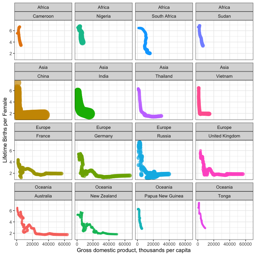
Plants and other animals have logistic growth forced upon them because of overcrowding. In humans, however, logistic growth has been largely voluntary. And there could be further developments in a lifetime. In many nations, birth rates are presently below replacement rates. In fact, in all nations with a gross national income above 16K dollars per person, the birth rate is at or below the replacement rate of 2.1 lifetime births per female (Figure 6.4). You can see how this transition happened over time here.
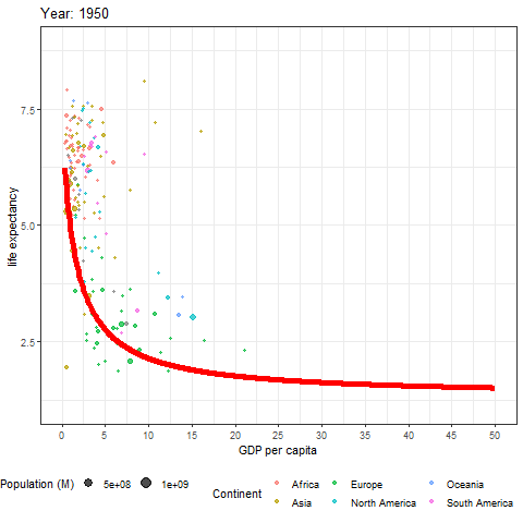
Fig. 6.1 Data from figure 6.4 shown through time. Each bubble represents a country, the size of the bubble is the countries population, and the colour of the bubble represents its continent. Learn more about these data at ourworldindata.org
This change in demographic rates could conceivably allow present and future generations to voluntarily adjust the population to whatever is desired. The new question just may be: what is the minimum world population we dare have?
Returning to your supervisor’s questions, you can now tell her that, in 2100, the world’s population will be between 10 and 12 billion. And you can say “The other population projections are not far off. They are slightly different from what we calculate using this method. But they use very complicated methods so you have to cut them a little slack!”
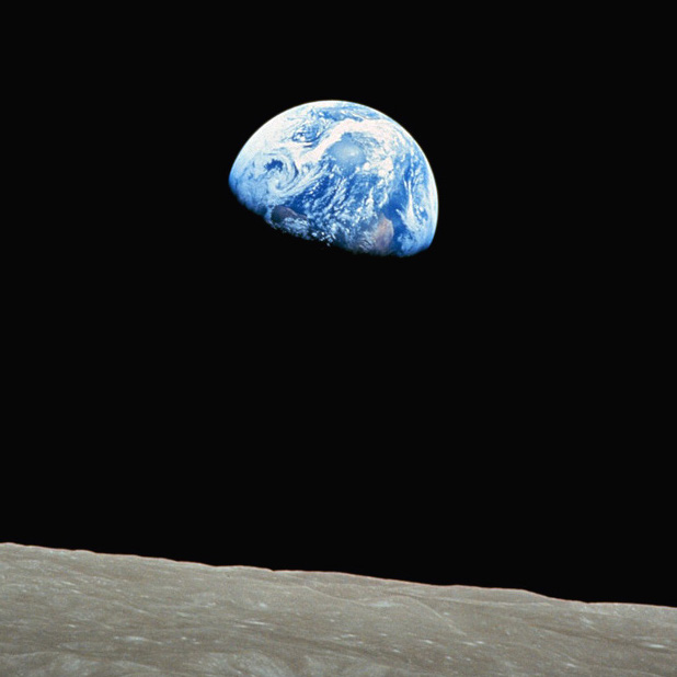
Fig. 6.2 Earth over Moon, touching the conscience of a world.